Confident whitespace
Open compositions create focus and make product visuals or concise statements feel more valuable.
Loading...
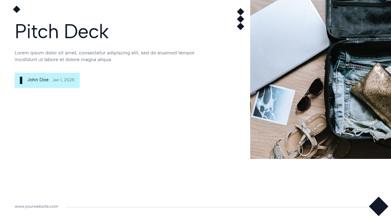
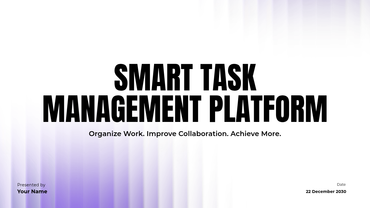
Clean, contemporary layouts with generous whitespace, confident typography, and bold visual accents for a polished presentation.
About this template
Every layout is generated from Presenton's real default template system. Text, charts, images, and visual elements remain editable, so the deck can adapt to your content without losing its design language.
Great for
Template guide
Modern combines confident typography, generous whitespace, and bold graphic accents for teams that want a contemporary presentation without visual clutter. It gives product ideas and brand stories a polished frame, allowing screenshots, short messages, and key metrics to carry more weight than decorative elements.
The template works well for product launches, startup narratives, agency proposals, and brand presentations. It is particularly effective when the deck must feel current and energetic while still being credible in a business setting. The layout system can move from a high-impact opening to detailed proof without losing visual continuity.
Open compositions create focus and make product visuals or concise statements feel more valuable.
Bold shapes and color moments add personality while preserving a clean professional foundation.
Layouts give screenshots, feature explanations, and benefit statements a clear visual relationship.
Suggested story
You can reorder or remove any layout, but starting with a clear narrative makes customization faster. This sequence is tailored to the kinds of presentations Modern handles best.
Open with the audience problem or market shift that makes your idea relevant.
Show the product, service, or creative direction through benefits and real use situations.
Add proof through results, customer evidence, capabilities, or a practical delivery plan.
Close with a specific proposal, launch step, partnership request, or call to action.
Use high-quality product imagery and crop it consistently across the deck. Keep the boldest accent for moments of change, such as a section divider or central benefit, and avoid filling every open area. A limited palette, direct headings, and real screenshots will make Modern feel tailored rather than generic.
Keep exploring