How to Create Stunning Data Presentations with Presenton in Minutes

Turning raw data into a captivating presentation used to take hours—sorting through spreadsheets, designing charts, and crafting a narrative that sticks. But in 2025, artificial intelligence has changed the game. With AI-powered tools like Presenton.ai, you can transform complex data into stunning, interactive presentations in just minutes. Whether you’re a business professional, educator, or content creator, this guide will show you how to leverage AI for data presentations that impress—fast.
Why AI is a Game-Changer for Data Presentations
AI doesn’t just speed up the process; it enhances the quality of your work. Traditional presentation tools require manual input for every graph, metric, and slide layout. AI, on the other hand, analyzes your data, identifies key insights, and designs professional slides automatically. Tools like Presenton.ai take it a step further by focusing on data storytelling—turning numbers into narratives that resonate with your audience. The result? Stunning presentations with graphs and metrics that look polished and deliver impact, all without the time sink.
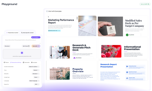
Step-by-Step: Creating AI Data Presentations in Minutes
Ready to get started? Here’s how to use AI to craft a presentation that wows your audience, using Presenton.ai as your go-to tool.
1. Gather Your Data
Start with the raw material—your reports, spreadsheets, or analytics. AI works best when it has structured data to analyze, like sales figures, survey results, or performance metrics. Don’t worry about formatting; Presenton.ai can handle the messiest datasets and turn them into something beautiful.
2. Upload to an AI Presentation Maker
Log into Presenton.ai and upload your data file—whether it’s a CSV, PDF, or Excel sheet. The AI scans your input in seconds, identifying trends, outliers, and key points. No need to manually highlight what matters; the tool does it for you.
3. Let AI Generate Stunning Visuals
Here’s where the magic happens. Presenton.ai converts your data into interactive presentations with graphs, charts, and metrics tailored to your content. Bar graphs for comparisons, line charts for trends, or pie charts for proportions—AI picks the best visuals and arranges them on sleek, professional slides. You can customize colors and styles later, but the default output is already presentation-ready.
4. Add a Data Storytelling Layer
Numbers alone don’t captivate—stories do. Presenton.ai’s AI suggests narrative elements based on your data, like a headline for a sales spike or a caption for a performance dip. Edit these to fit your voice, and you’ve got a presentation that doesn’t just show data but tells its story.
5. Finalize and Share
Review the slides in minutes, tweak as needed (e.g., adjust fonts or add your logo), and export. Presenton.ai offers formats like PowerPoint, PDF, or a shareable link, making it easy to present in meetings, classrooms, or online. The whole process—from upload to export—takes less than 10 minutes for most users.
Tips for Maximizing Your AI-Powered Presentation
To make your data presentation truly stunning, keep these pro tips in mind:
- Focus on Key Metrics: Highlight 3–5 critical data points rather than overwhelming your audience with everything. Presenton.ai’s AI can prioritize these for you.
- Use Interactive Elements: Add clickable charts or hover-over insights (a feature in Presenton.ai) to engage viewers during live presentations.
- Keep It Visual: Lean on graphs and visuals over text. AI tools excel at creating presentations with graphs that are both clear and eye-catching.
- Test Your Story: Run your slides by a colleague to ensure the narrative flows. AI gets you 90% there; a quick human check seals the deal.
Why Choose Presenton.ai for AI Data Presentations?
There are plenty of AI presentation makers out there, but Presenton.ai stands out for its focus on data visualization and speed. It’s built to handle complex datasets—think financial reports, research findings, or marketing analytics—and turn them into slides that don’t just inform but inspire. Plus, its intuitive interface means you don’t need design skills to get professional results. In a world where time is money, Presenton.ai saves you both.
Real-World Example: From Spreadsheet to Stunning Slides
Imagine you’re a sales manager with a 50-row Excel sheet of quarterly results. You upload it to Presenton.ai, and within minutes, you’ve got a 10-slide deck: a bar chart of top-performing regions, a line graph of revenue trends, and a summary slide with AI-generated insights like “Q3 saw a 15% spike driven by Product A.” Your team is impressed, your boss is happy, and you didn’t spend your evening in PowerPoint purgatory.
The Future of Presentations is AI
As data grows more central to decision-making, the ability to present it effectively becomes a superpower. AI doesn’t just make this easier—it makes it faster and better. With tools like Presenton.ai, you’re not just keeping up; you’re setting the standard.
Ready to ditch the old way of building presentations? Try Presenton.ai today and create your next stunning data presentation in minutes. Your data has a story—let AI help you tell it.